
Typography that survives the pack.
A typographic direction is not finished when one front panel looks convincing. It has to keep the brand, product and mandatory information readable across sizes, SKUs, languages and manufacturer dielines.

Packaging typography connects two systems: the visual identity and the product-information architecture. Both have to be defined before individual font sizes or line breaks can be judged.
Give each text level one job.
A packaging typographic system is a repeatable hierarchy for brand, product, variant, benefit and required information across all agreed SKUs and formats.
Begin with the information, not the typeface. List the brand name, product descriptor, flavour or function, active ingredient, quantity, claims, instructions and regulatory copy. Decide which of them a customer must recognise first, second and only after picking up the pack.
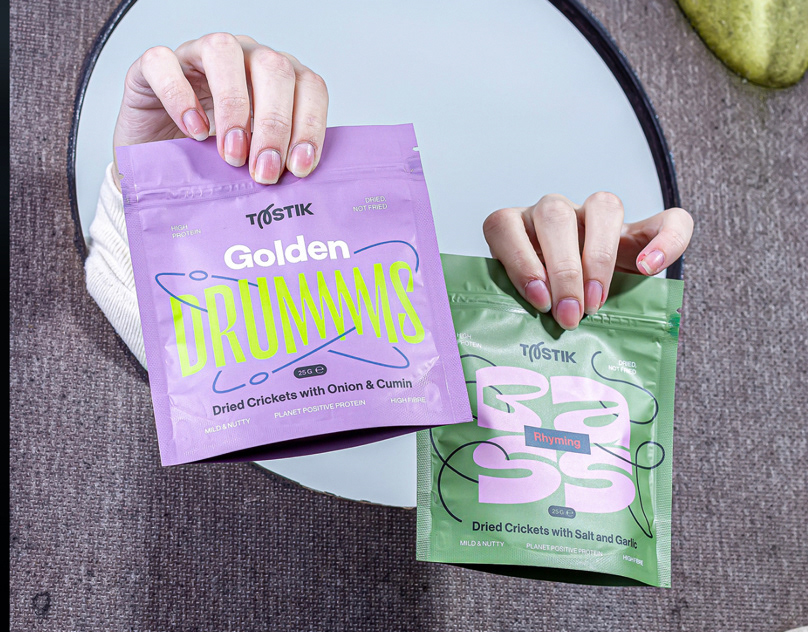
In the Tastik packaging description, bold typography, flavour differentiation and illustration organise a family of flour, pasta and snack pouches. The useful evidence is not one type treatment in isolation, but its repeatable role across product types.
Language is a layout constraint from the beginning.
- Confirm every required script, diacritic, numeral, currency and punctuation mark before selecting or drawing the final type.
- Test the longest real product name and densest mandatory copy, not placeholder text.
- Define whether languages share one panel, alternate between markets or require separate artwork files.
- Protect hierarchy when translated phrases expand or break at different points.
- Use approved translations and regulatory copy; the designer should not infer legal wording.
A custom wordmark may remain fixed while supporting text uses a licensed family with broader language coverage. That is often a more reliable system than forcing one custom asset to perform every typographic role.
Small formats expose weak systems quickly.
A carton, pouch, narrow sachet, stick pack and bottle label cannot share the same composition literally. They can share the same reading order, alignment logic, type relationships and variant device.
- Map printable areas. Include seals, folds, seams, curves and barcode zones.
- Test the narrowest panel. Long product names and mandatory lines reveal the real minimum size.
- Separate constants and variables. Keep brand recognition stable while flavour, function or dosage changes deliberately.
- Review the set together. The family must be visible without making variants indistinguishable.
Use custom typography where it creates recognition.
A custom wordmark, product name, numeral set or lettering asset can create an ownable moment on the front of the pack. Supporting information still needs a robust hierarchy and appropriate character coverage.
Commission only the characters and behaviours that the product system can justify. If future variants require editable names, define a broader set. If one brand name remains fixed, a controlled vector wordmark may be the more precise deliverable.
The decision guide on wordmarks, lettering and typefaces explains how these final assets differ.
Run the production test before handover.
- 01Apply approved copy to the final manufacturer dielines and every agreed format.
- 02Check small type, reverses, line weight and colour contrast against the intended material and print method.
- 03Verify the longest names, all languages and the densest legal panel.
- 04Outline, package or embed type according to the printer workflow and licence.
- 05Name files by SKU, format, language, version and production status.
A final artwork review should compare the complete range, not only inspect files one at a time. This exposes accidental hierarchy changes, outdated copy, missing language versions and inconsistent font handling before the package reaches the producer.
Twelve Moons connects this work through custom typography, packaging design and production-ready artwork.
Related work
Typography inside product systems.
Typography and packaging
Have the names, languages and formats?
Send the SKU list, required languages, current identity files and available dielines. That is enough to identify the typography and packaging scope.
Discuss the product system