
Wordmark, lettering or typeface?
These terms describe different design objects. Choosing the wrong one can create unnecessary work, incomplete language support or a final asset that the client cannot use in the way they expected.
The scope should be named by what the client needs to reproduce after the project, not by how expressive the sketches look during development.
A wordmark owns one name.
A custom wordmark is a fixed drawing of a brand or product name, designed for consistent recognition and supplied as controlled artwork rather than as a typing system.
A wordmark is appropriate when one name needs a distinctive construction and will be placed repeatedly across identity applications. The final files normally need scalable vector artwork, approved lock-ups, colour versions and minimum-use guidance. They do not automatically include an alphabet for typing new words.
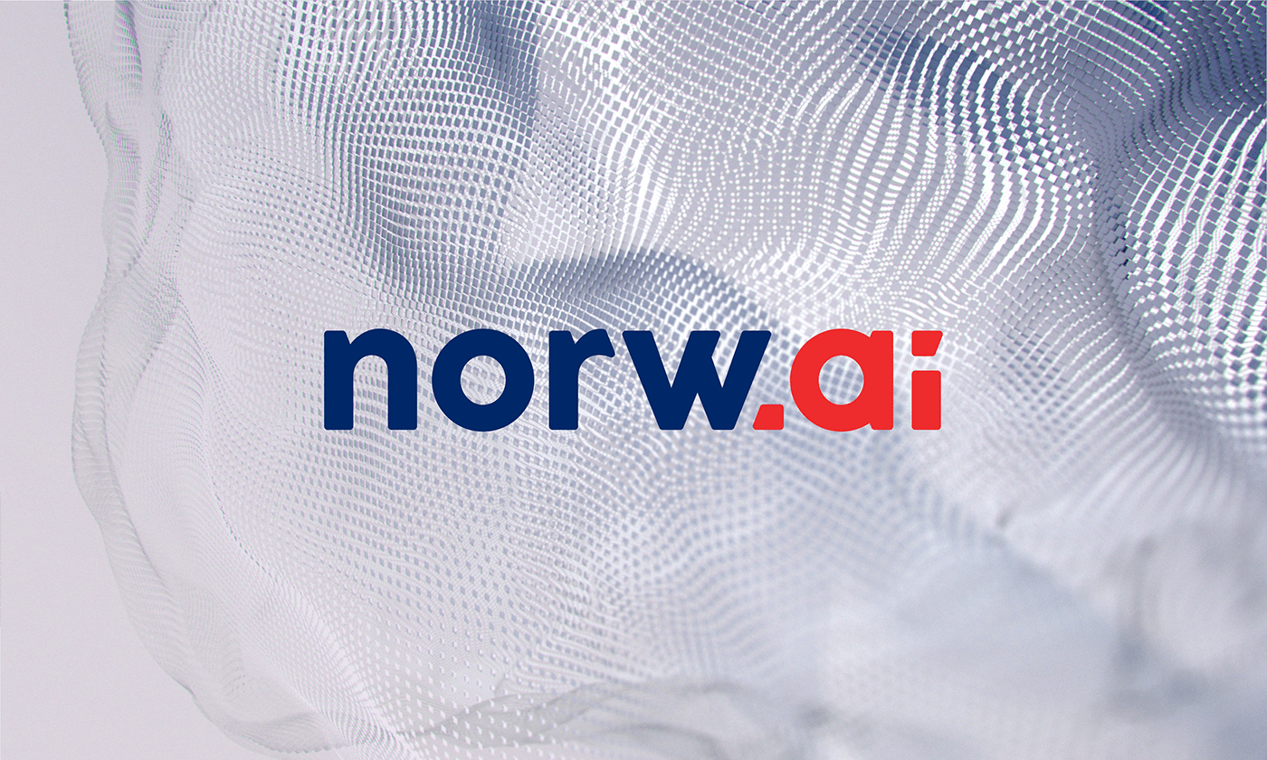
The Norw.ai project is presented as a wordmark for an artificial-intelligence company. Its scope is the branded name, not a complete editorial typeface.
Lettering creates a specific composition.
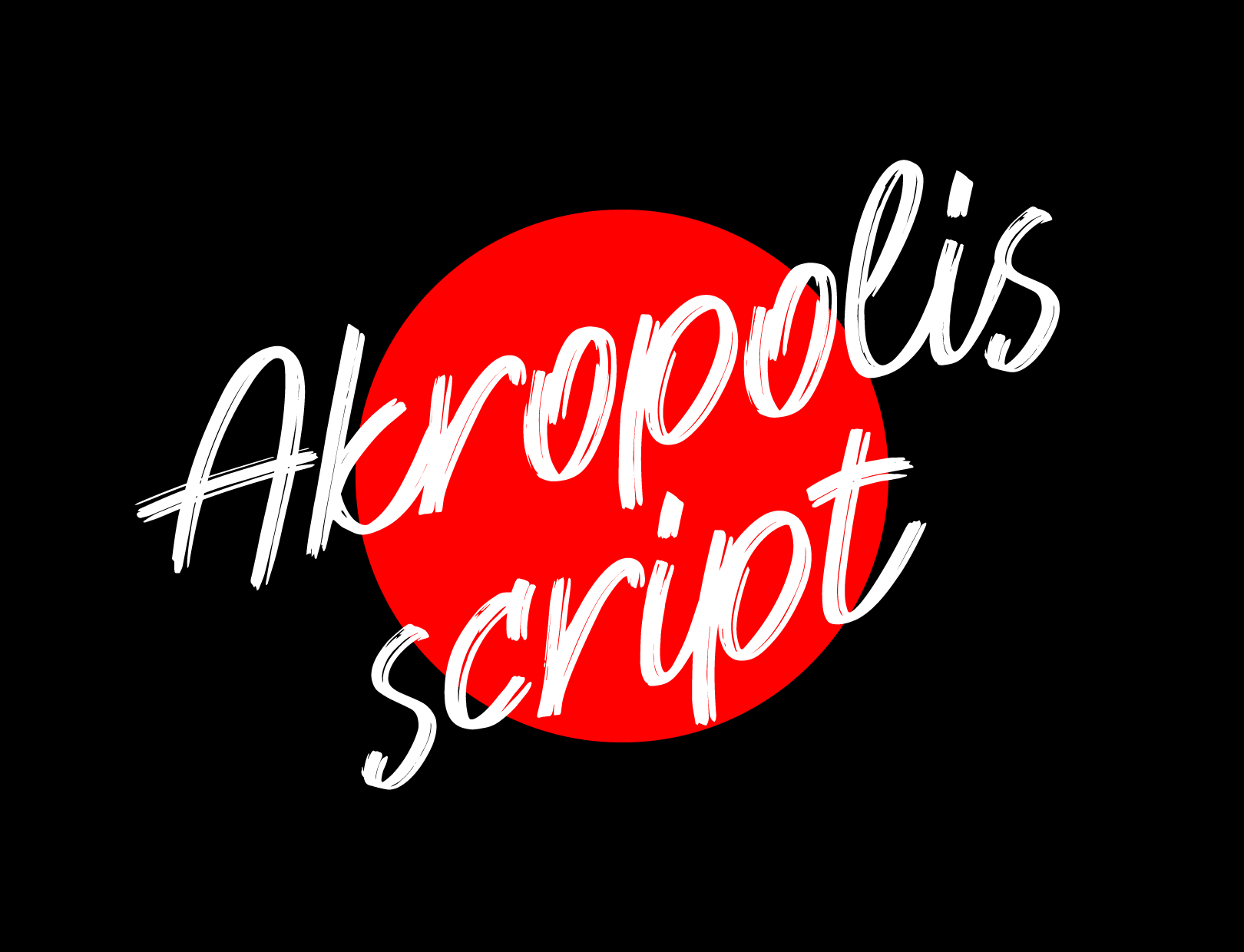
Lettering is a drawn typographic composition made for a particular phrase, title, pack, campaign or edition.
Lettering can be more flexible than a wordmark in tone and composition, but it remains tied to the text that was drawn. It works well when packaging or communication needs an ownable expressive moment without requiring every future message to use a custom font.
Before commissioning lettering, list every phrase, size, crop and language version. A later change in wording is a new drawing task, not the same operation as editing live text.
A typeface creates repeatable behaviour.
A custom typeface is a reusable character system designed to compose new text within an agreed set of scripts, styles, weights and technical features.
It becomes relevant when teams need to type many changing names, messages or product variants while keeping a distinctive voice. The scope expands with character count, languages, diacritics, weights, spacing, kerning, OpenType behaviour, testing and font-file generation.
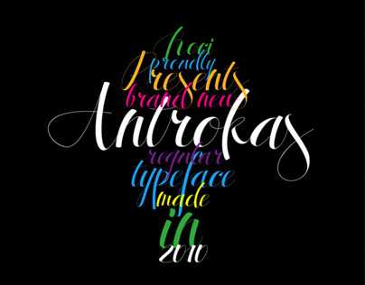
Antrokas is described as a typeface developed from the earlier Pirmokas project. That kind of system solves a broader input need than a single wordmark.
Ask what the final user must be able to do.
- Place the same name: a wordmark or fixed lettering asset may be sufficient.
- Use several approved phrases: a lettering set can cover a controlled list.
- Type new names or text: a font or configured type system is required.
- Localise the brand: required scripts and diacritics must be included from the start.
- Send files to producers: confirm whether they receive outlined artwork, editable source files, fonts or a packaged production file.
Ownership, permitted users and font licensing must be written into the proposal or handover. A visual preview cannot answer those questions.
A compact decision rule.
- Choose a wordmark when one name is the recognisable asset.
- Choose lettering when one or several fixed phrases need a specific expression.
- Choose a typeface when users must create new text inside a repeatable system.
- Combine them only when the applications justify the additional scope.
The custom typography service begins by identifying which of these objects the brand actually needs.
Related work
One name, one script, one system.
Typography scope
Name the application. We can name the right deliverable.
Send the exact text, required languages, applications and who needs to edit the result after handover.
Scope a typography project