
Custom typography or a licensed font?
The useful question is not whether custom type looks more special. It is whether the brand needs to own a particular set of letterforms, applications or behaviours that an existing typeface cannot provide efficiently.
A brand can be distinctive with a licensed typeface and generic with a custom one. The difference comes from the role typography must perform, the quality of the direction and whether the result is tested in real use.
The short answer.
when the primary need is a reliable text system, the brand can create distinction through other assets and the chosen licence covers every intended user, channel and territory.
when recognisable letterforms are a central brand asset, existing fonts cannot solve the required character or application, or a limited custom asset can do the job more precisely than a complete typeface.
Custom does not automatically mean a full font. A brand may need only a wordmark, a small lettering set, numerals for packaging or a display alphabet. Naming the right object keeps the scope proportionate.
When a licensed font is the stronger choice.
- Long-form reading, interfaces or documents need a mature character set and extensive technical support.
- The schedule favours selecting and configuring a proven family rather than drawing and testing new glyphs.
- The brand already owns distinctive colour, image, composition or motion systems, so typography can play a supporting role.
- Required scripts and languages are already covered by a suitable family.
The licence still matters. Confirm who can install the files, where they can be embedded, whether the use includes apps, websites or packaging and how the agreement treats future users or territories. These terms come from the foundry or distributor, not from the visual appearance of the font.
When custom letterforms earn their place.
Custom work is most useful when the letterforms carry recognition at the moment the brand name or product is seen. A wordmark may require one controlled drawing. A campaign may need expressive lettering. A packaging range may need repeated names, numerals or language-specific characters that behave as a system.
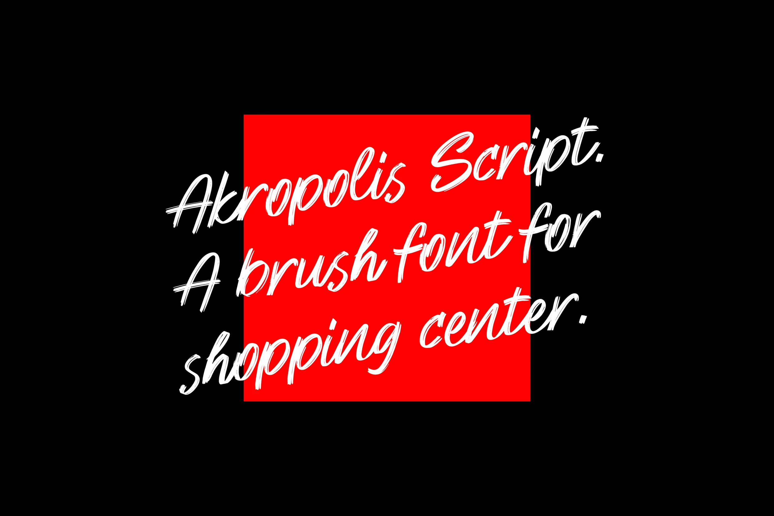
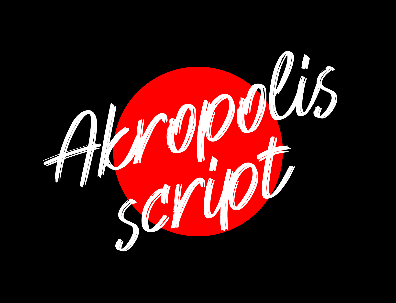
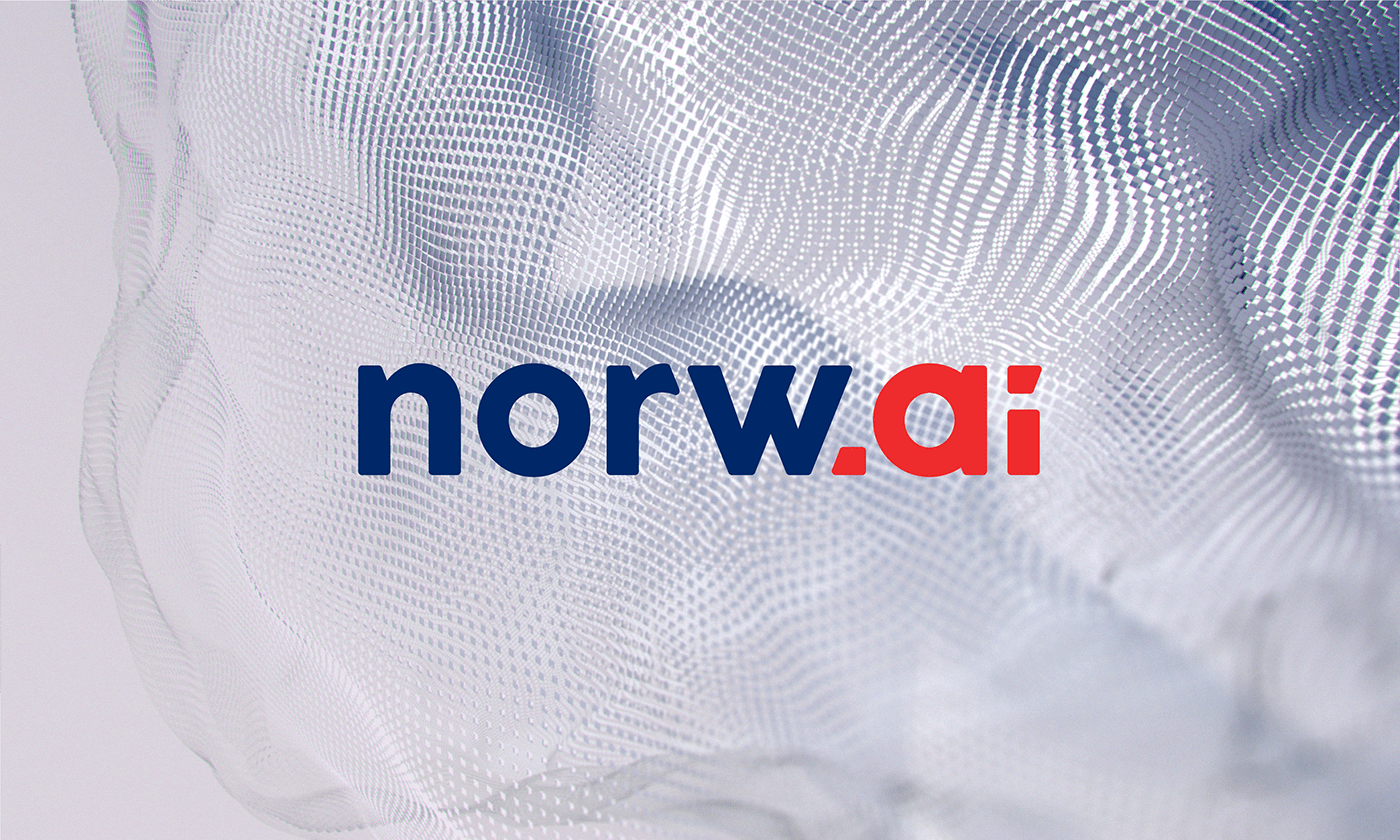
Norw.ai is presented as a wordmark project: the name itself is the designed asset. Akropolis Script is a wider typography project credited to Rokas Cicėnas for Akropolis through Not Perfect Vilnius. They demonstrate different scales of custom work; neither should be described simply as “choosing a font”.
Five decisions that reveal the right route.
- What must be recognisable? A name, a phrase, a product range or an entire communication system?
- How many characters are genuinely required? Include numerals, punctuation, diacritics and planned languages.
- Where will the typography live? Test packaging, signage, social assets, presentations and small reproduction separately.
- Who must use it? A fixed artwork asset and an installable font create different handover and licensing needs.
- What must remain editable? Future naming, SKUs and localisation may require a system rather than a finished composition.
If the brief cannot answer these questions, style exploration is premature. The first scope should clarify the applications and ownership model.
What to send for a useful typography scope.
- 01The brand or product name and the exact text that must be designed.
- 02All required languages, diacritics, numerals and recurring product terms.
- 03Real applications and the smallest or most technically difficult use.
- 04Existing identity assets and the character the typography must reinforce or change.
- 05Who needs to edit, install or reproduce the final asset after handover.
Twelve Moons scopes wordmarks, lettering and type systems through its custom typography service.
Related work
Different scales of custom type.
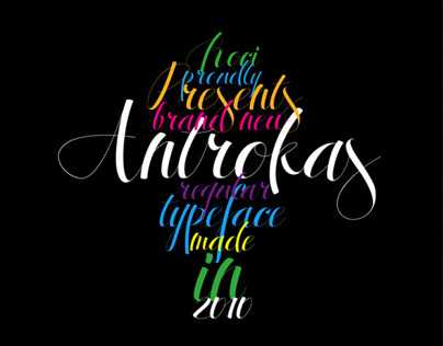
Typography project
Need to define the right typographic object?
Send the name, applications, languages and editing needs. That is enough to distinguish a font-selection task from a wordmark, lettering or broader type system.
Discuss custom typography