How Typography, Colour and Photography Build One Brand System
A brand does not become coherent because every asset follows a guideline. It becomes coherent when the major visual decisions reinforce the same position.
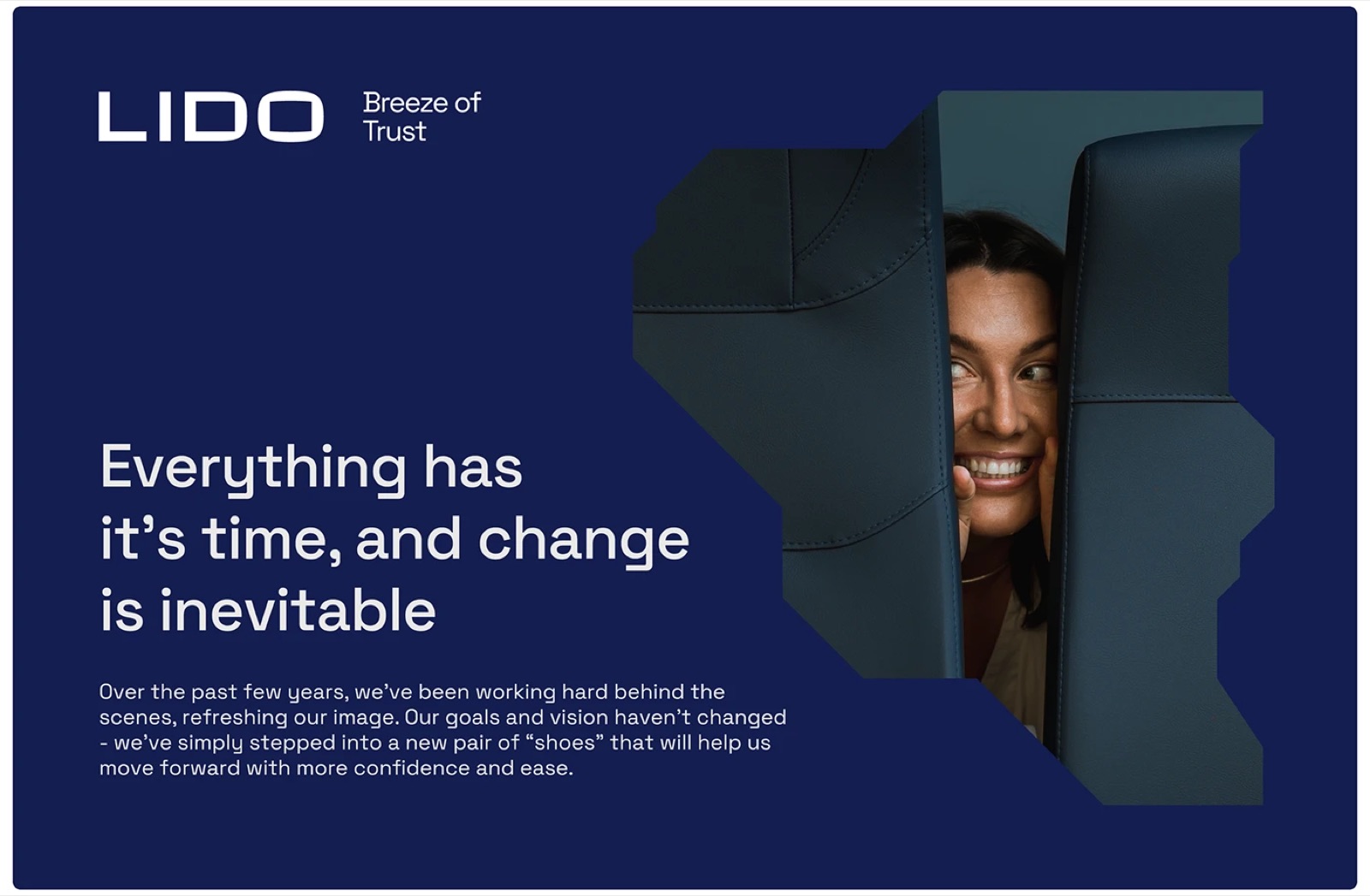
A brand does not become coherent because every asset follows a guideline. It becomes coherent when the major visual decisions reinforce the same position. This guide separates the decisions, evidence and handover needed to make that idea usable.
1. Translate one position into several visual behaviours.
Typography can establish authority, pace or warmth. Colour can create recognition and control emphasis. Photography can define subject, distance, light and emotional tone. Each layer has a different job, but all should point to the same intended character.
If the strategy calls for informed accessibility, an institutional typeface, luxury colour palette and distant corporate imagery may send three conflicting messages.
2. Give each layer a clear role.
Decide which layer carries recognition and which supports information. A distinctive typographic voice may allow colour to remain controlled. A bold colour system may need quieter typography. Photography can carry human evidence while graphic elements provide structure.
Not every application needs every asset. Rules should explain what remains when one layer is absent.
3. Test colour through hierarchy.
Evaluate colour on text, backgrounds, data, calls to action and accessibility-critical combinations. A palette is not a row of swatches; it is a system of proportions and roles.
Compare the palette with direct competitors. Category familiarity can be retained without repeating the most owned combination in the market.
4. Direct photography with practical decisions.
A useful photography direction defines subject matter, casting, composition, crop, light, depth, colour treatment and what should not appear. A moodboard should prepare decisions for a photographer rather than collect images with a vague shared mood.
Test text over representative images and in layouts where the image must work beside product or service information.
5. Review complete applications.
Present the identity as a connected system across a few meaningful applications. Change only one variable at a time when diagnosing why a concept feels wrong. This prevents an isolated logo or colour reaction from replacing an informed decision.
Twelve Moons develops the typographic layer through its brand typography service and can extend the agreed scope into the related identity decisions.
Before commissioning the work
Questions that clarify the scope.
Should typography or colour be chosen first?
Start with the strategic and functional requirements, then develop the layers together enough to test their relationship.
Does a photography moodboard count as art direction?
It is a starting tool. Useful art direction also defines practical choices for subjects, composition, light, crop and treatment.
Must every brand application use photography?
No. The system should remain recognisable when photography is unavailable or inappropriate.
Brand typography
Show where the current identity stops working.
Send the current identity, priority applications, required languages and the decision that triggered the project. That is enough to define whether the next step is an audit, a typography system or a wider refresh.
Discuss the project