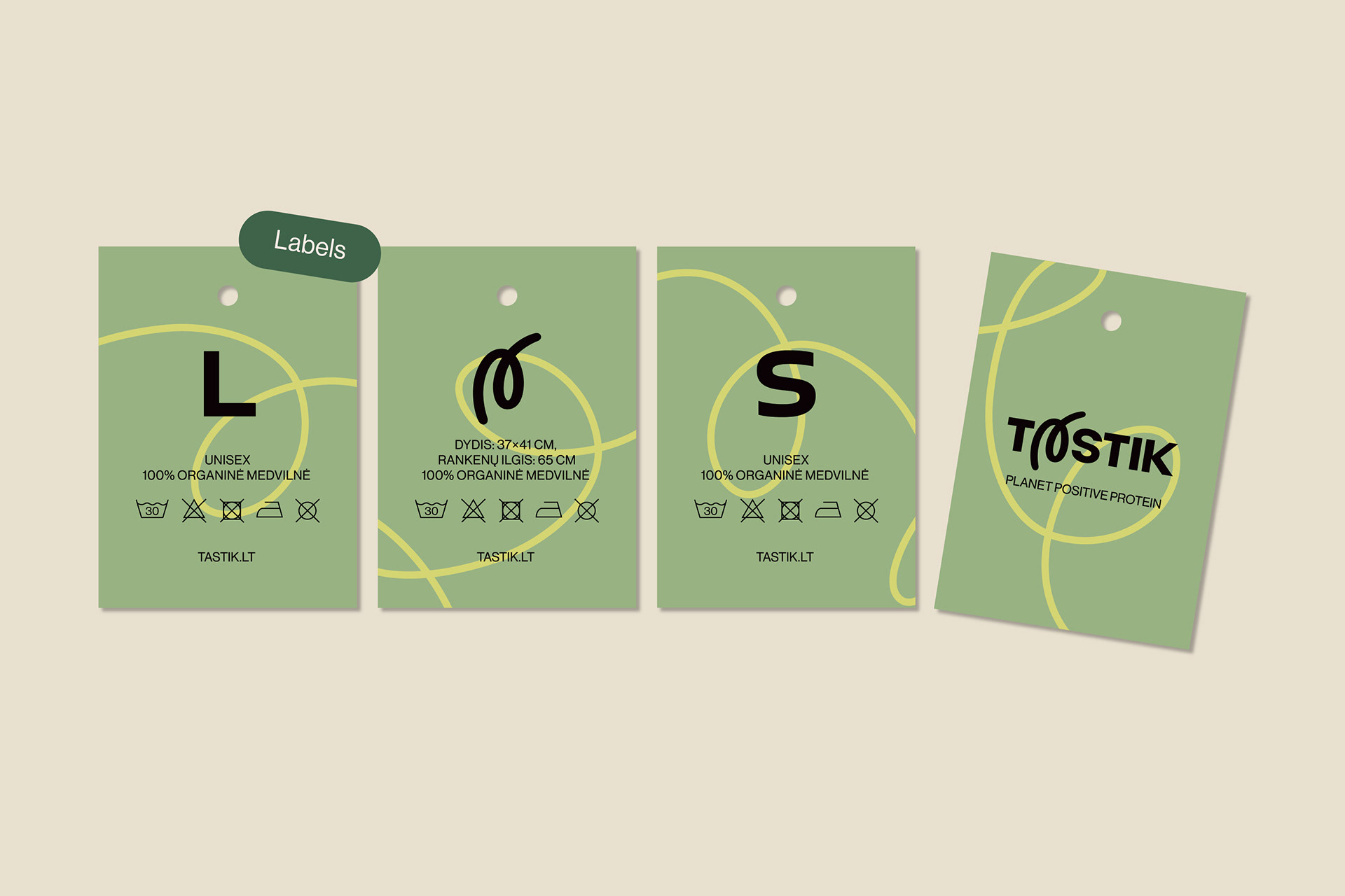
Concept
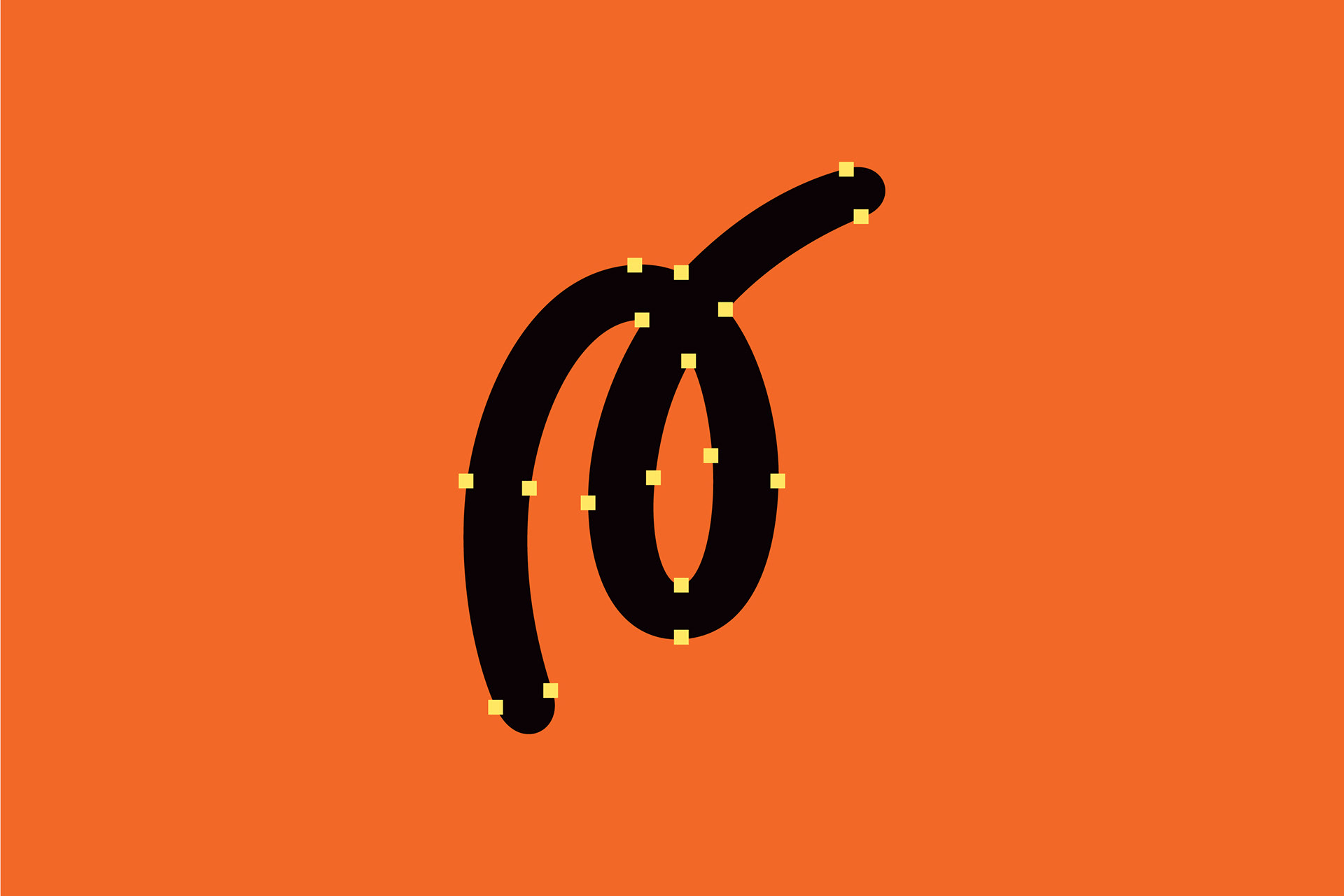
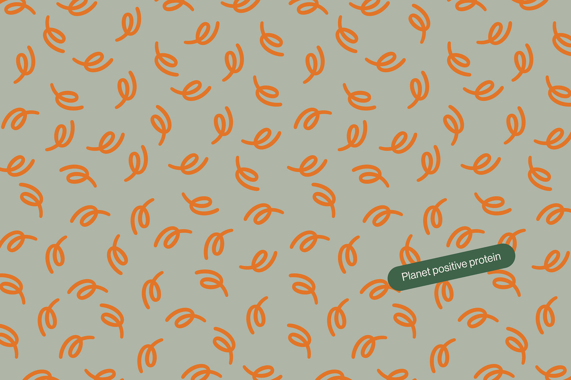
The group of crickets is called the Orchestra (Scientific term). Rhythm, sounds, melody, frequency scale, dynamics, timbre - these components that make up music affect our feelings & inspire us to create. This is how the Orchestra of letters was born. The experimental typography is meant to be the primary visual and communication tool. Letters are elements that are very abstract but also very meaningful.
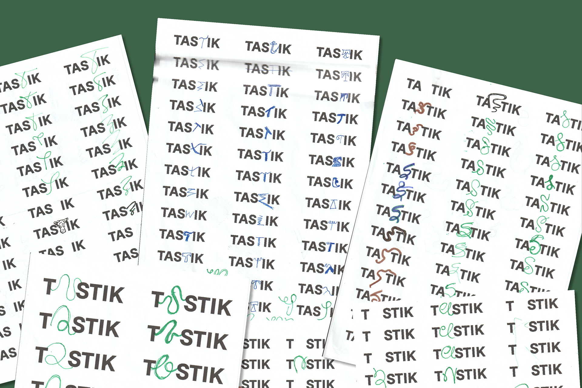
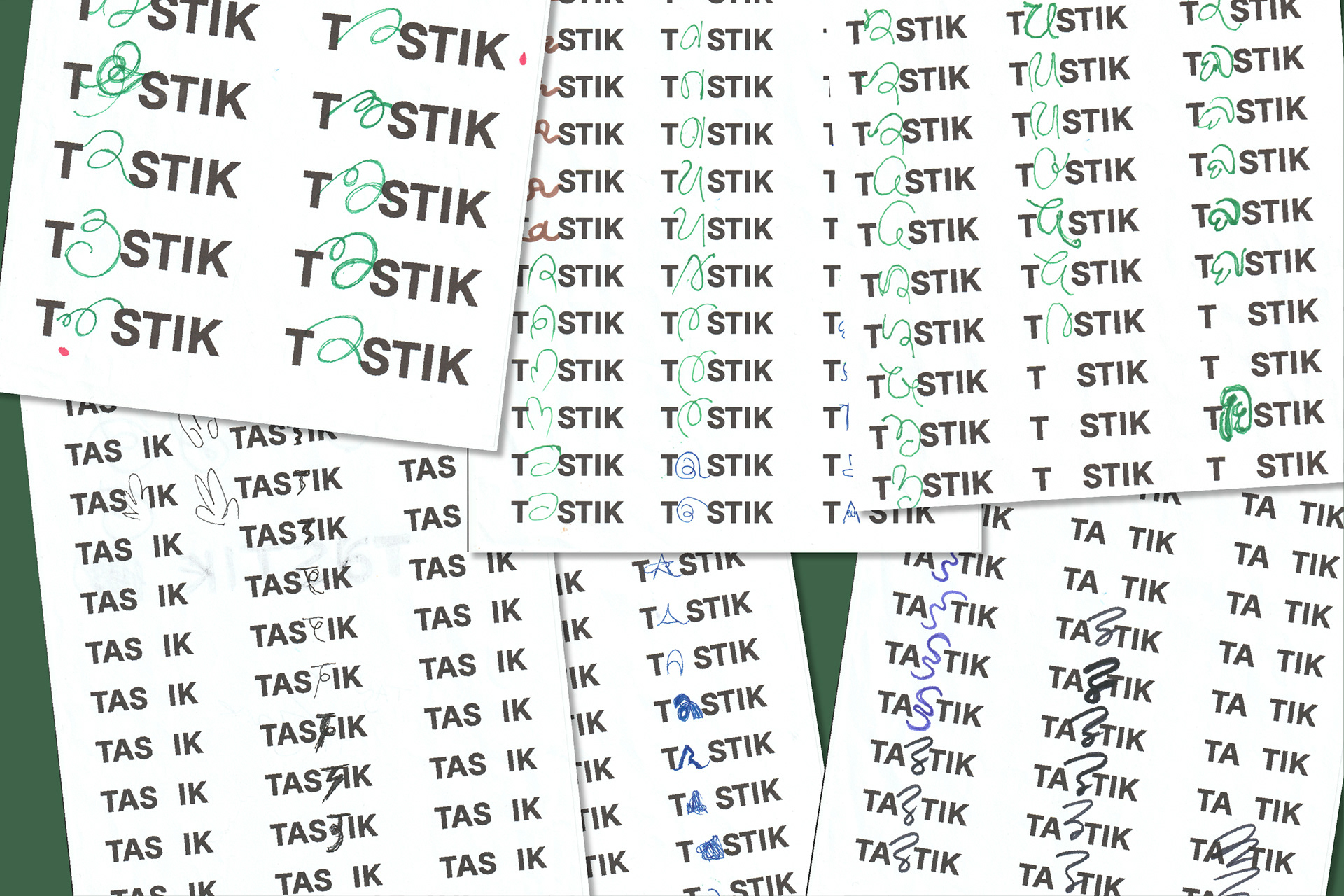
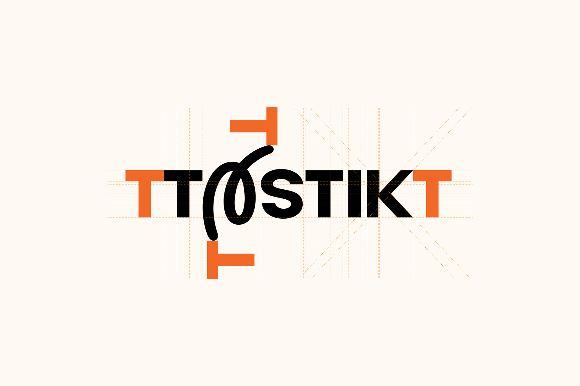
As the concept indicated, letters should represent and code the sounds of the music. The lines reinforce the dynamic and create an unforgettable emotion.
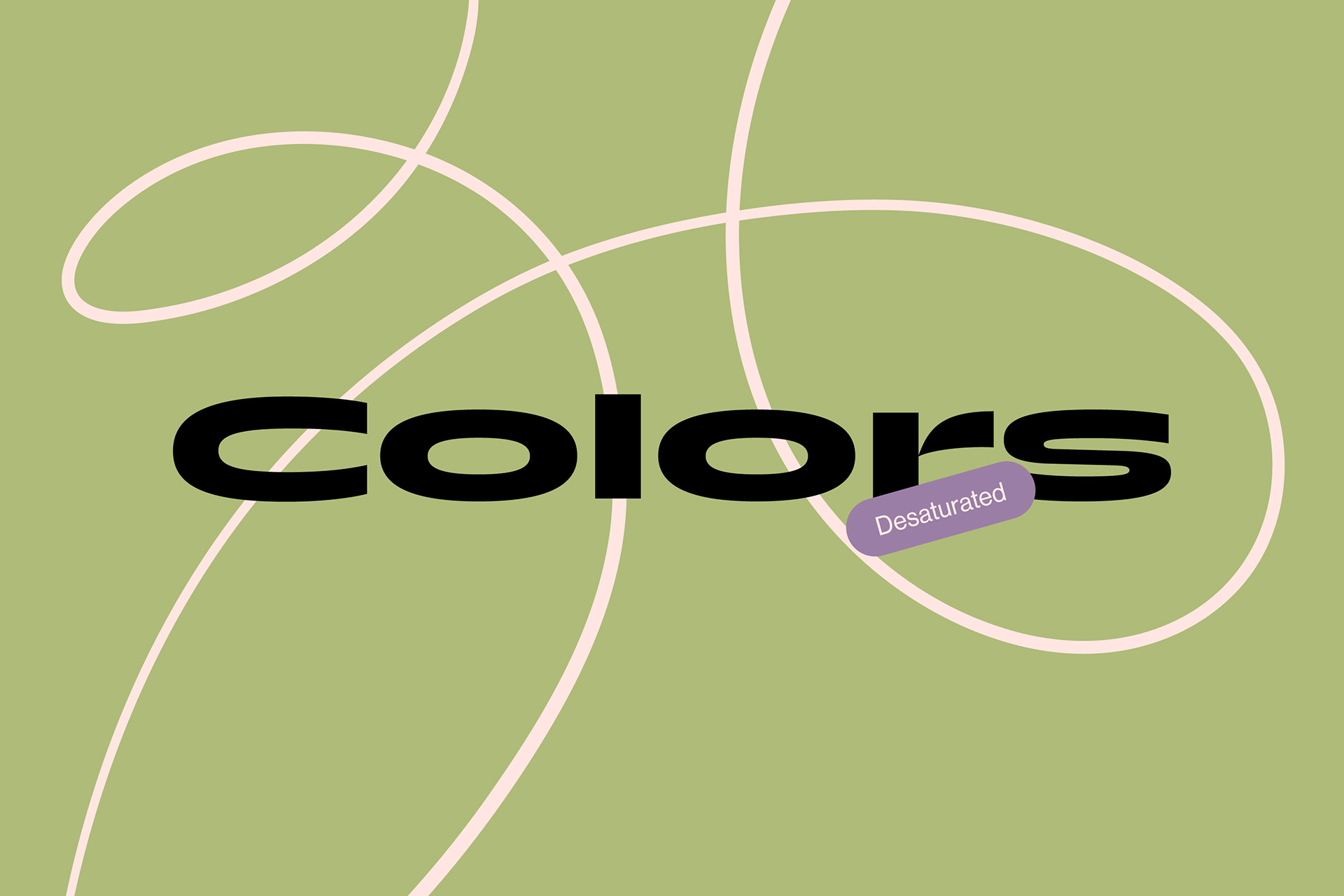
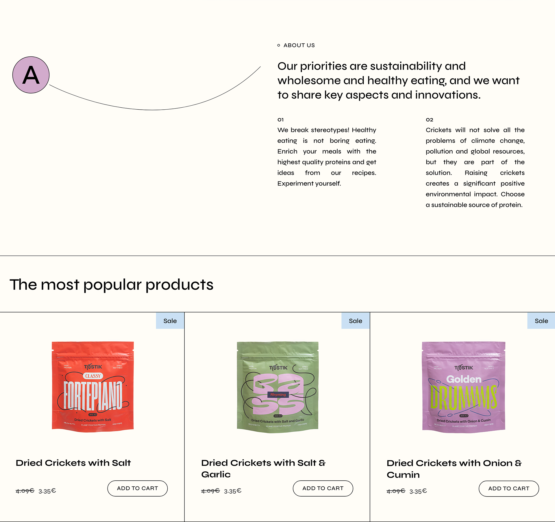
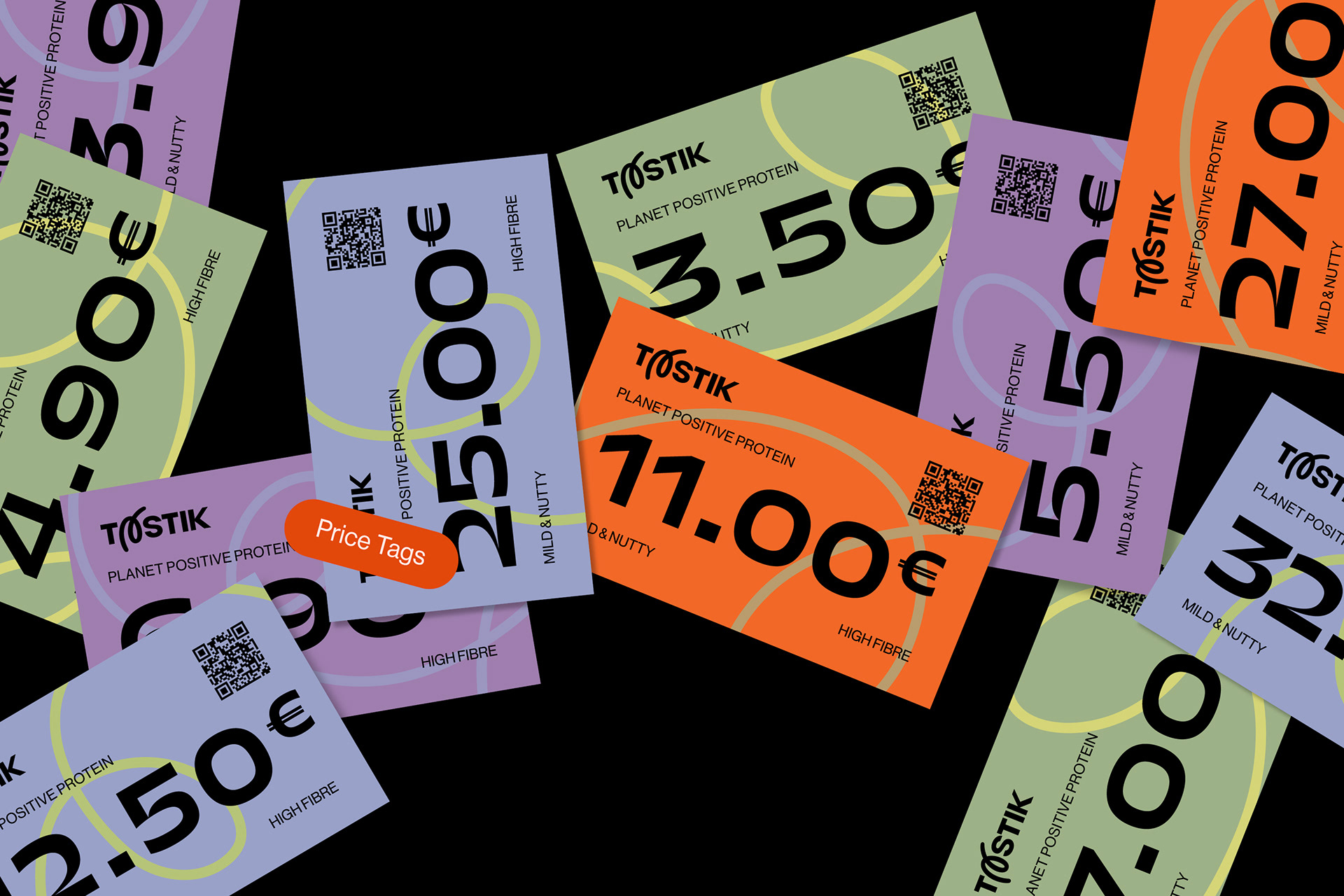
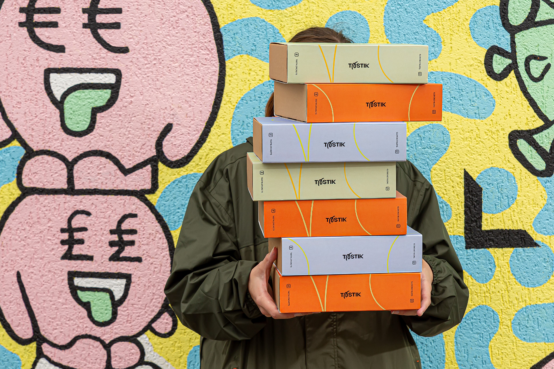
Following up the concept of orchestra & music, each Dried Crickets product or flavour were named by different kind of music term or instrument. And of course Typographic illustrations became not only as a supplement for naming but also as a main packaging element.
The group of crickets is called the Orchestra (Scientific term). Rhythm, sounds, melody, frequency scale, dynamics, timbre - these components that make up music affect our feelings & inspire us to create. This is how the Orchestra of letters was born. The experimental typography is meant to be the primary visual and communication tool. Letters are elements that are very abstract but also very meaningful.
As the concept indicated, letters should represent and code the sounds of the music. The lines reinforce the dynamic and create an unforgettable emotion.
Following up the concept of orchestra & music, each Dried Crickets product or flavour were named by different kind of music term or instrument. And of course Typographic illustrations became not only as a supplement for naming but also as a main packaging element.


View Packaging part 🡒 here
Credits
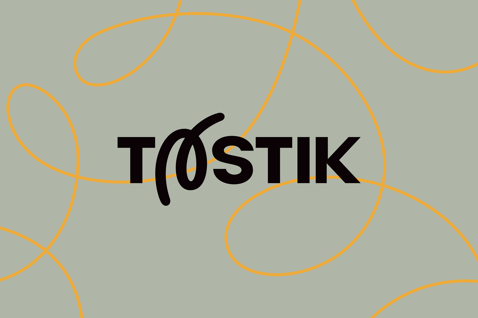
Client: MB Tastik
Brand: Tastik
Art Direction: Rokas Cicenas
Concept Direction: Rokas Cicenas, Ugne Ruskyte
Graphic design: Rokas Cicenas, Ugne Ruskyte
Photography: Regimantas Meilutis
Year: 2022
© Twelve Moons
______
Thanks for watching!